This content has been archived. It may no longer be relevant
One of my greatest inspirations, Mike Parker, died last Sunday, February 23rd at the ripe old age of 85. He has been described as “the font god” which, to be fair, is probably an accurate description for the man who helped bring Helvetica to the world. However, he is also credited with the development of more than 1,100 typefaces while at the Mergenthaler Linotype Company.

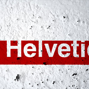
What is it about the Swiss and their sans serif typefaces? Helvetica emerged from Switzerland in 1957 and went out to shape the modern world. The Helvetica typeface would sort out not just transport systems, but whole cities. The font appeared as Europe emerged from the shadow of World War II and was already making strong contributions to midcentury modernism. Helvetica was perfectly suited to this period, and its use reflected another pervasive force of the age–the coming of mass travel and modern consumerism.
Helvetica is a font of such practicality and beauty that it is both ubiquitous and something of a cult. The typeface even inspired a compelling and successful movie (Gary Hustwit’s Helvetica), whose premise is that on the streets of the world, the font is like oxygen; you have little choice but to breathe it in.
To entrench something so deeply into a society takes a level of understanding and passion that is hard to describe. So I will not begin to try. I will simply let Mike Parker do it himself.
“When you talk about the design of Haas Neue Grotesk or Helvetic, what it’s all about is the interrelationship of the negative shape, the figure-ground relationship, the shapes between characters and within characters, with the black, if you like, with the inked surface. And the Swiss pay more attention to the background, so that the counters and the space between characters just hold the letters. I mean, you can’t imagine anything moving; it is so firm. It is not a letter that bent to shape; it’s a letter that lives in a powerful matrix of surrounding space. It’s… oh, it’s brilliant when it’s done well.” – Helvetica (2007), directed by Gary Hustwit
Every person is affected by Helvetica in some way. Whether you’re taking the bus, shopping for clothes, enjoying a meal, or even decorating the offices here at bloomfield knoble (see below), Helvetica is part of your life in some way.
Thank you Mike Parker for making the world easier to read.
No better way to spend a Saturday than hanging out with friends @Andy_Edwards_ and @clarkbachelot @bloom_tweets pic.twitter.com/wYWnHH0TfE
— Thomas J Thompson (@t_j_thompson) May 25, 2013
Related articles
 ‘Godfather’ of famous font dies
 Mike Parker, Godfather Of Helvetica, Dies
 ‘Godfather’ of Helvetica font dies
 Legendary type designer dies, all Helvetica breaks loose


