This content has been archived. It may no longer be relevant
As designers we grow accustomed to the trends in the web design world and try to utilize them to the best of our abilities while also trying to initiate our own trends in the process.
Sometimes a trend is truly progressive and takes the field as a whole in a new direction – like flat design. Other times trends were bad to begin with and somehow gained popularity anyway.
Here at bloomfield knoble we strive to pursue the best design possible for any given project. That often means guiding the client away from what they have previously seen and taken a liking to. Below you will find the top 5 trends that we find the most repulsive.
1. Popup Windows
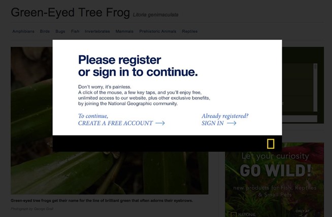
While traditional popup windows are mostly now reserved for spam websites, they have actually started morphing into automatic window overlays that take the form of ads, newsletter signups or God forbid, surveys.
It doesn’t really need to be said here but I will anyway; ads are good for the site’s revenue but terrible for the user experience. In the end we need to find a better solution to generating ad revenue without turning the end user away from the site’s content.

2. Flash
With the ubiquity of mobile devices and mobile browsing, there’s no excuse for a site in 2014 that still uses Flash.
Yes, animation is cool on a website but only when used in a subtle and effective way. Plus there are so many other, better ways to accomplish that now. Also, do not forget those all-important mobile users that you may be leaving out.
3. Skeuomorphism
Skeuomorphic design is essentially designing something to resemble, as closely as possible, a real tangible item. For example putting a leather texture on a web calendar so it resembles the calendar one might find on a desk.
While skeuomorphic design had a time and a place while trying to bridge the gap between technology and “real world” items, it is not needed anymore and users will much prefer a more simple design that focuses on functionality instead of overly designed flourishes.

4. Images Used for Text
There is no reason a site designed for modern browsers should need to use an image for text. Google Fonts API is compatible with every browser since IE6 (and shame on you if you inherently support that browser anyway).
5. Bad Stock Photos
This is a tricky one because clients often cannot afford an on-set shoot for every ad they produce. Plus, stock photos that don’t come across as looking like stock photos can either be expensive or hard to make/produce yourself.
At the end of the day though, a good rule of thumb is that having no photo at all is still better than a horrible stock photo, so weigh your options carefully.
The solution…
A lot of these issues can be taken care of before they ever start. Good design is about taking risks, exploring new ideas, and creating something that works well in the end. There is no need to use technology just for the sake of using it. Too many HTML5 websites appear to be a sample of how talented the designer is. That is never the goal with a client’s website. Design is important, but so are business goals. In the end if your design does not accomplish the goal that was set forth in the brief then you have failed as a designer.
Designers need to check their ego at the door and remember that good design, when done right, will be an easy-to-use tool that not only looks good but also can perform, convert, and fulfill its purpose.


