This content has been archived. It may no longer be relevant
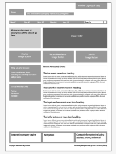
The concept of “wireframing” finds itself near the beginning of the creative process, in which a blueprint of a website or interface is laid out to represent the skeletal framework of the content before any major design work has begun. It is a pivotal part of understanding the larger picture on an extremely simplified level.

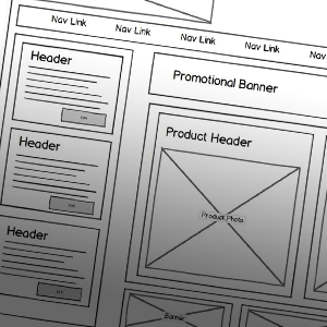
Wireframes usually consist of placeholder content and images with very little detail or enhancement. Once the overall concept of the layout is agreed upon, the full design is executed using the wireframe as a guide. This preproduction concept has many advantages, but the most important are the organization of content and the optimization of productivity and time management.
Content Organization
Traditional website and interface design usually calls for the layout and presentation of information to be organized in such a way that communicates the message most effectively to the user. Because of this, the distribution of content must be thought out and purposefully considered.
There is a reason why most navigational menus are linear in design and hug either the top or side edge of the webpage. It’s also common to see an account login in the upper right corner. Over the course of time, the user has defined what these preferences are and will tend to look for familiar content in familiar places—the mastery and application of these tendencies is known as user interface (UI) or user experience (UX) design.

Therefore, the content should drive the design on both a macro and micro level. Understanding UI in terms of content layout as well as specific details in graphic appearance will allow the message to be digested more easily by the user.
All things considered, the guidelines of UI design are exactly that: guidelines. Designers can incorporate unique approaches to the layout of the content, and wireframes help them achieve that without wasting valuable time and effort.
Optimized Productivity
Time and effort are highly important resources to those in the creative arena, just like any industry, so the use of wireframes is almost necessary to prevent the excessive use of them. It would take a general contractor a lot more time to complete a structure, room-by-room, making it up as he goes. The master plan allows him to allocate his time and effort accordingly.
Many people don’t realize that websites and interfaces can be made up of a large number of content elements, such as a rotating image masthead, navigational areas, search bars, social media feeds, blog posts, etc. Picking and choosing where and how to layout these particular elements can be like solving a tangram puzzle. Each and every little piece has its own specific place; a wireframe expedites that delicate placement process.
Having a blueprint set and approved can also help manage the expectations of the client. If a consensus on the layout is achieved before any actual design work begins, the receiving party won’t be unpleasantly surprised when comps are provided. There’s nothing worse than pouring hours and hours of time into a design that doesn’t meet the client’s expectations.
Wireframing Tools
There are many resources available to designers to help generate wireframes. At bloomfield knoble (bk), we take advantage of the Balsamiq Mockups application, which provides various templates for websites, device interfaces and other user applications.
Balsamiq Mockups also offers a library of different shapes and placeholder content elements commonly used and supported by proven UI design fundamentals. The drag-and-drop functionality makes the application extremely easy-to-use, further enhancing productivity. The service also incorporates a feedback feature, allowing clients to easily review and comment on the wireframed layout. Axure and Pidoco are a couple of other tools available online.
When developing designs for websites and user interfaces, best practices suggest the use of wireframes to assist with content organization and responsible production resource allocation. It will only make your life easier.

